Manage Actions
Action Definition
- During a typical delivery process, the drivers need to perform certain manual tasks, which includes (In chronological order):
- 1 - Check-in at the Depot at the beginning of the working day or working shift
- 2 - Load products onto the delivery vehicles and leave the Depot
- 3 - Check-in at the Customer locations upon arriving, hand over products to the Customers, receive payment, and confirm the delivery result
- 4 - Travel back to the Depot; hand over collected payment and returned products (If available) to the warehouse managers, perform necessary paperwork, and finally Check-out of the Depot, end their working shift (or working day)
- Apart from the usual delivery tasks, unexpected events might occur that hinder the delivery process, such as vehicle failure; traffic jams, etc.. The drivers need to record those events and inform the dispatchers
- To help the dispatcher manage the tasks of the drivers in the most efficient way possible, in Abivin vRoute we provide the Actions feature. This feature allows the dispatchers to digitize the actual manual delivery tasks of the drivers by shifting them onto the Mobile app, provide a solution to manage the works of the drivers on the Web app in real-time, getting rid of the tedious manual paperwork. Each of the delivery tasks mentioned above will be represented by a resource called the Action Code
Locate Action Code list
- Action Codes are listed in the Tasks > Actions tab
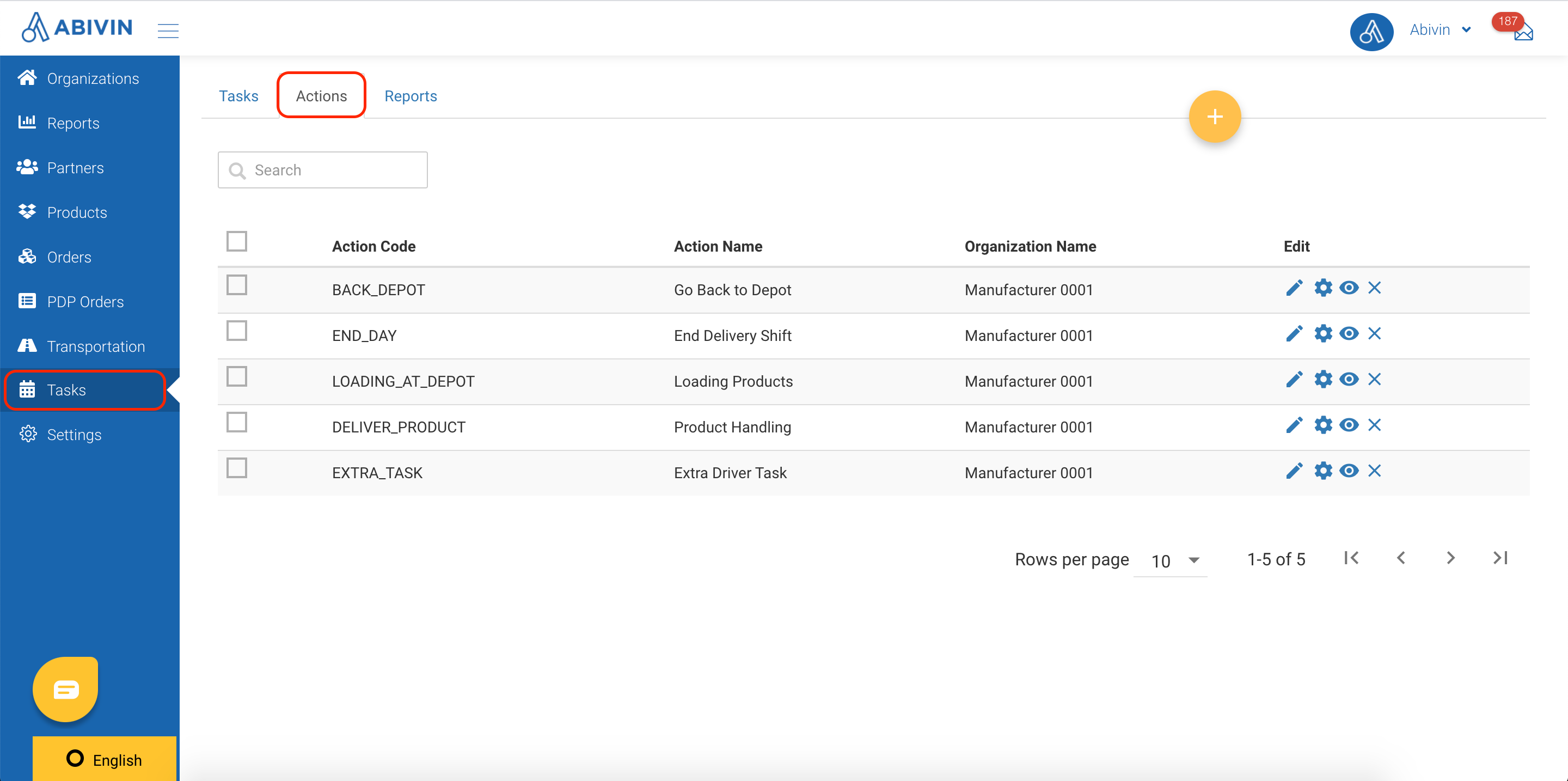
Illustration (English)
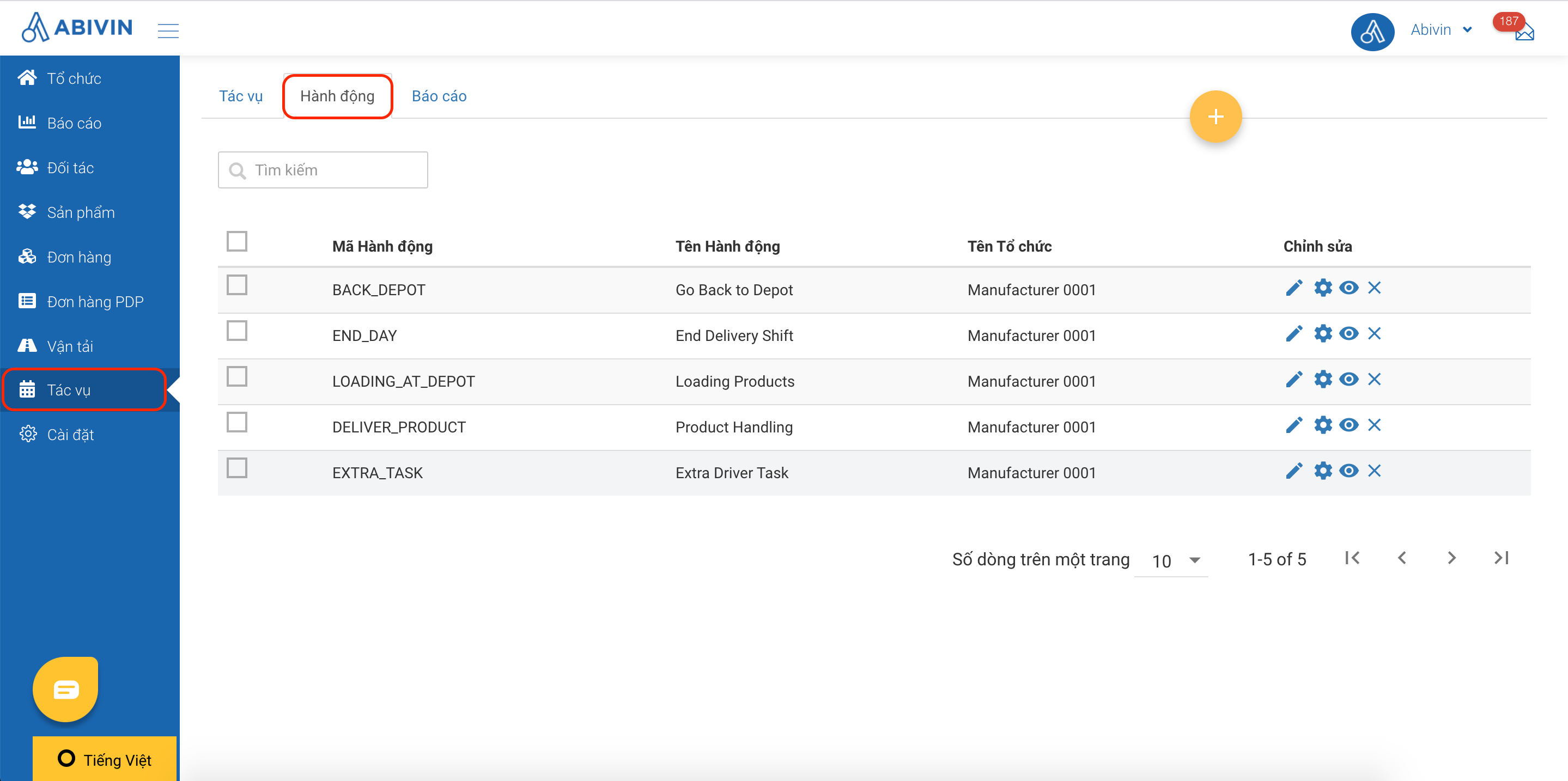
Illustration (Vietnamese)
Create Action Codes
- On the Tasks > Actions tab you will notice that a set of Action Codes has been automatically created. These are the default Action Codes of the VRP/DC model
- In case the Action Code list is empty or the Action Codes appear differently than the ones shown in the Action Code table below, you need to create the correct Action Codes using the Excel import file. DO NOT use the Webform to create the Action Codes
Action Code information fields
- Below are the Action Codes of this model
- Notes: Delete the quotation marks when you input the Action Codes in the Excel import file
Action Code | Action Name (Can be changed) | Action Description | Organization Code |
|---|---|---|---|
"LOADING_AT_DEPOT" (Required) | Load Products at Depot | The drivers check in and load products at the Depot at the beginning of the Delivery Trip | Always input the Organization Code of the: Manufacturer |
"DELIVER_PRODUCT" | Deliver Products to customer | The drivers travel to the customers' locations, hand over the products to the customers, receive payment and confirm delivery results | Always input the Organization Code of the: Manufacturer |
"BACK_DEPOT" | Go back to Depot | The drivers travel back to the Depot, hand over collected money and returned products (If available) to the Depot manager and perform required warehouse paperworks | Always input the Organization Code of the: Manufacturer |
"END_DAY" | End Delivery shift | The drivers check out of the Depot, end their Delivery Shift | Always input the Organization Code of the: Manufacturer |
"EXTRA_TASK" | Extra Task | The drivers inform unexpected event during the Delivery process | Always input the Organization Code of the: Manufacturer |
- Here is how the Action Codes Excel import file should look like:

Illustration (English + Vietnamese)
Create Forms For Action Codes
- The Action Codes recently created have not yet had any information inside. Imagine them as blank Excel spreadsheets. In order for the Mobile app users to see and perform their tasks on the Mobile app, you have to build the display/input fields for each Action Code using the Form Building function
Enable Form Building Function
- By default, the system will not allow you to create forms for the Action Codes. In the Tasks > Actions tab, under the Edit column there are only two icons like so
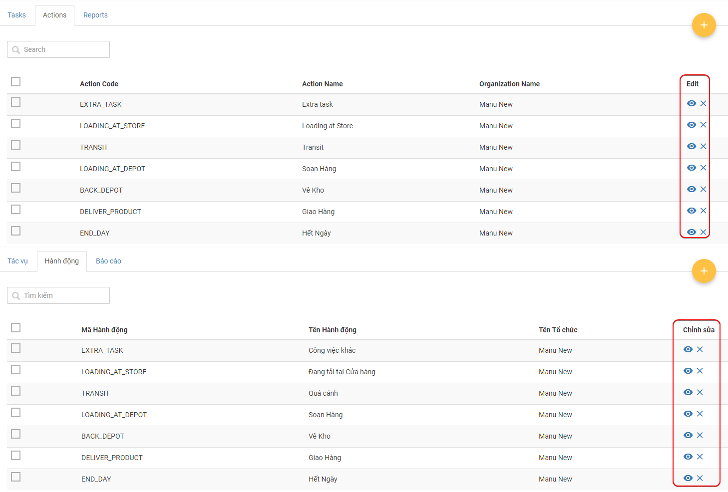
- You need to enable the Form Building function for the Top Administrator User Group
- To do this, follow the steps below:
- 1 - Navigate to the Organizations > User Groups tab
- 2 - Click the Edit icon of the Administrator User Group of the Manufacturer
- 3 - On the Update Group form, scroll down until you see the Module section. Tick the All checkbox of the Task Actions module
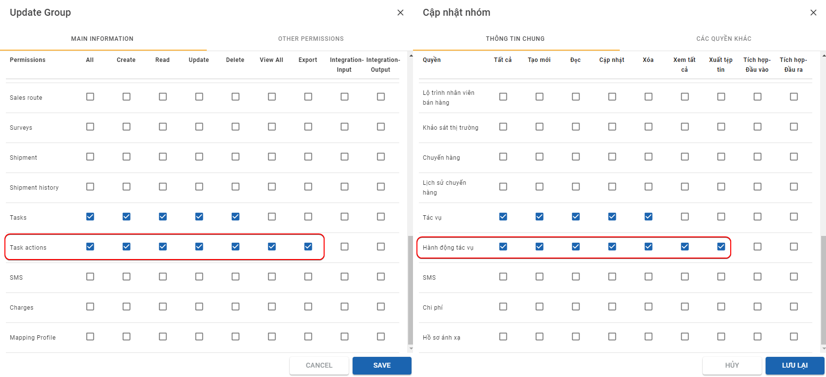
- 4 - Click Save to confirm the change
- Now, navigate back to the Tasks > Actions tab and refresh your Web app (Hit the Ctrl F5 key combination on your keyboard). After refreshing, notice there are two more icons under the Edit column
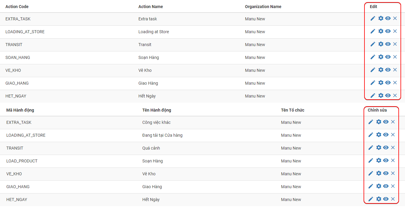
- Notice the cog icon . It is the Form Builder icon. This will allow you to build forms for the Action Codes
General Steps To Build Forms For Action Codes
- Each Action Code will display different information and require different input from the Mobile app users, therefore each of them needs to have different forms
- This section will explain only the most general steps to build the forms for an Action Code. Below we will explain in more details the specific information needed for each Action Code
- Below are the general steps to build forms for an Action Codes
- 1 - Click the Form Builder icon of the Action Code

- 2 - You will be navigated to the Form Builder screen
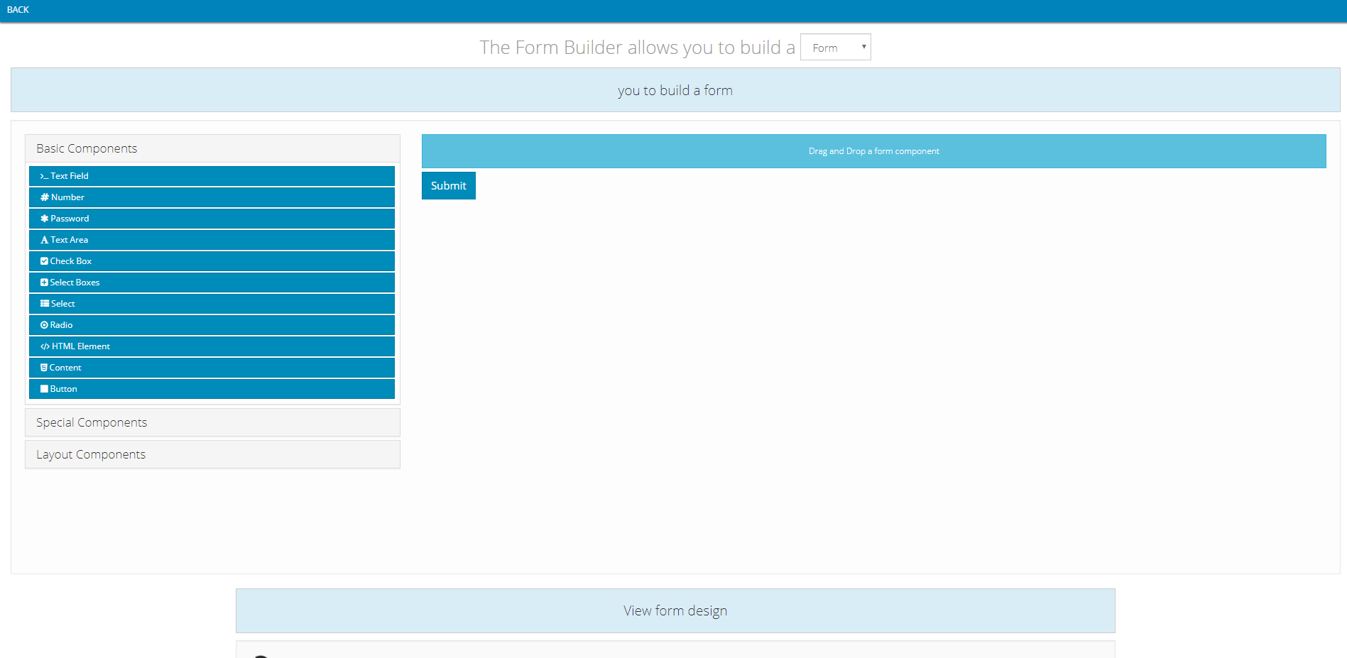
- 3 - You will see a blue button titled Submit. You need to remove that button by hovering your mouse over it, then click on the red remove icon on the far right

- 4 - Now, look at the panel on the left side. This is the Component panel, from which you can select which component to use for the Action Code
- There are three sub-sections on this panel: Basic Components; Special Components; Layout Components. Clicking on each sub-section title will reveal the components of that sub-section

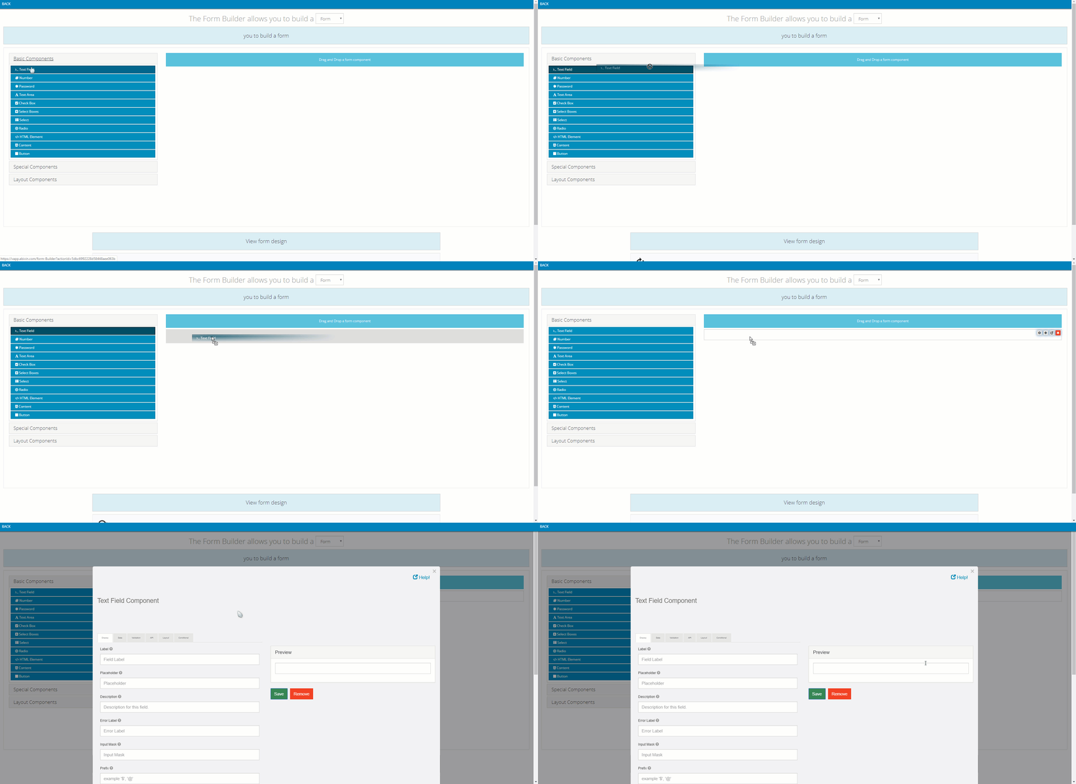
- To use a component for the Action Code, simply left-click and drag that component to the intended space on the right side
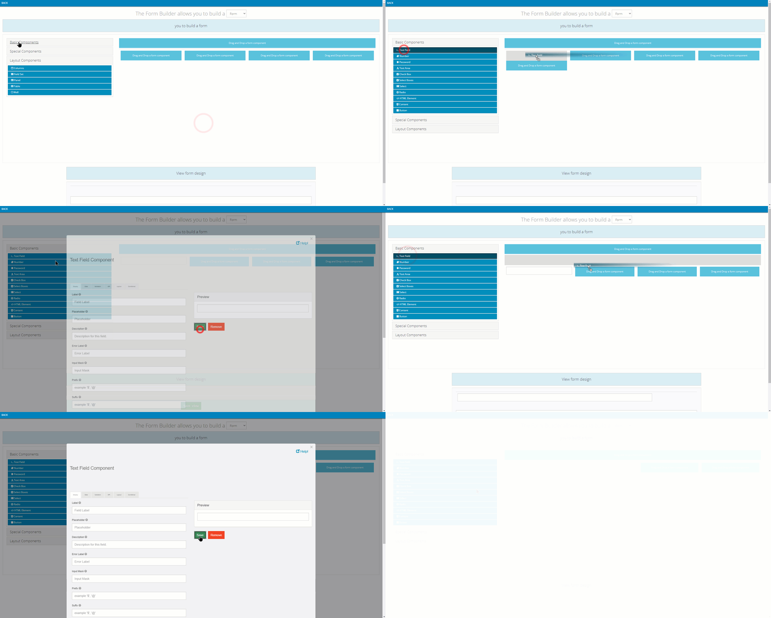
- If the Action Code contains multiple components, you can flexibly position the components. For example, a component can be placed above or below another component. With the Layout Components, you can even drag the Basic Components to within them
- After the component has been moved to the intended space, the setup form of the component will appear. Input data into that form, then click the green Save button to save the form
- We will specify the input detail for each component below
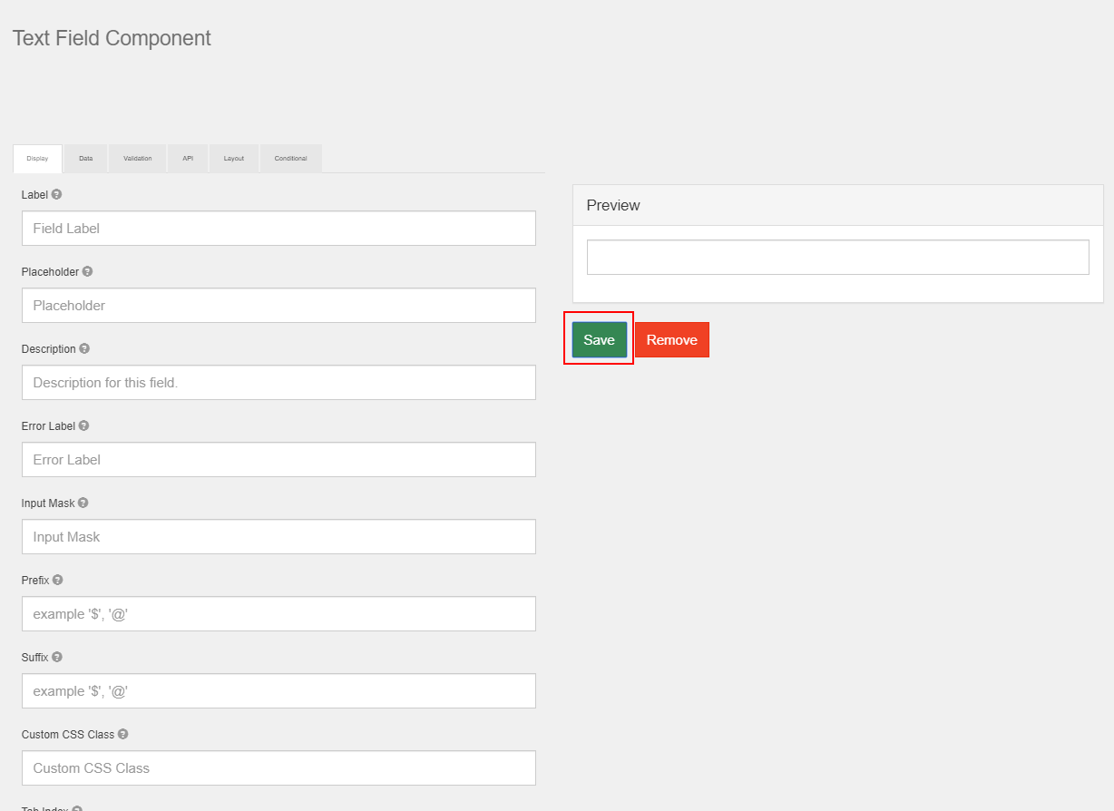
- IMPORTANT After you have finished setting up all the necessary components, do not close this screen just yet. You need to scroll to the bottom of the Form Builder screen then click on the green Save View button in order to save all the forms you have set up so far
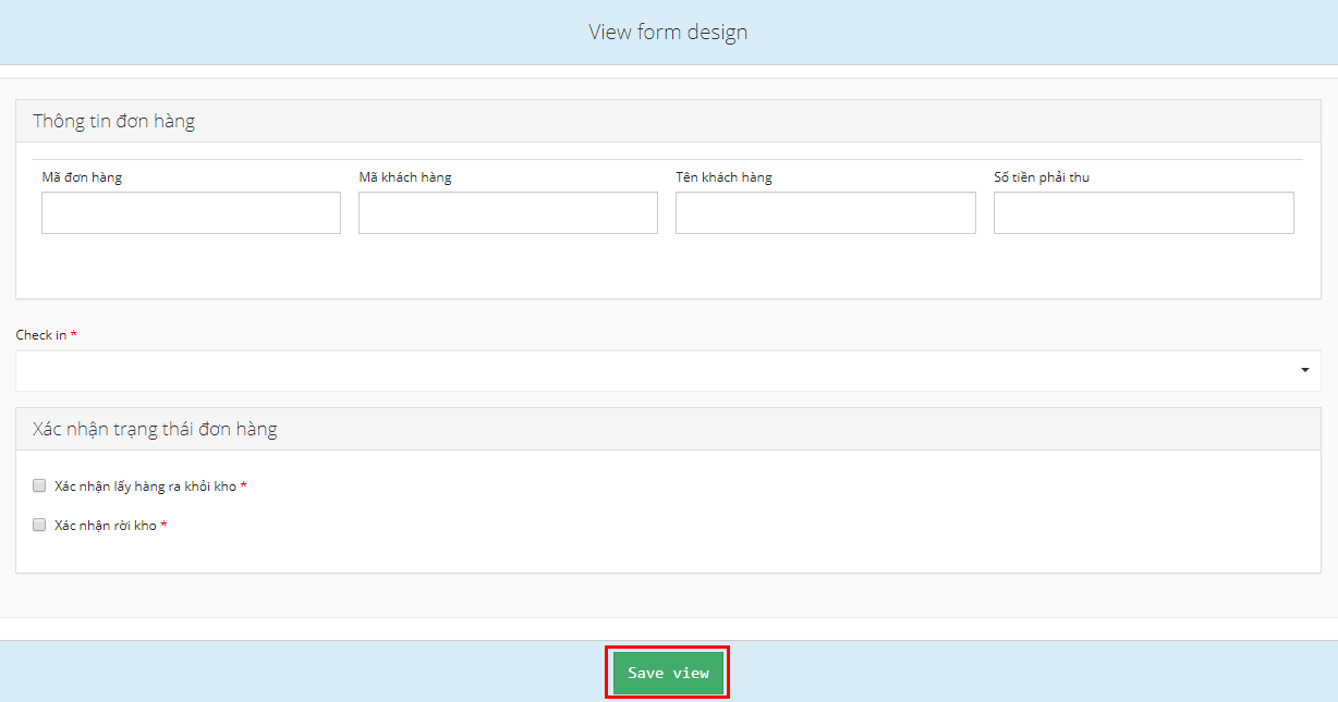
- A success message will appear

- Now that the Action Code has been successfully set up, you can click on the Back text on the top left of the screen to get back to the Action Code list tab. There you can continue to build forms for other Action Codes
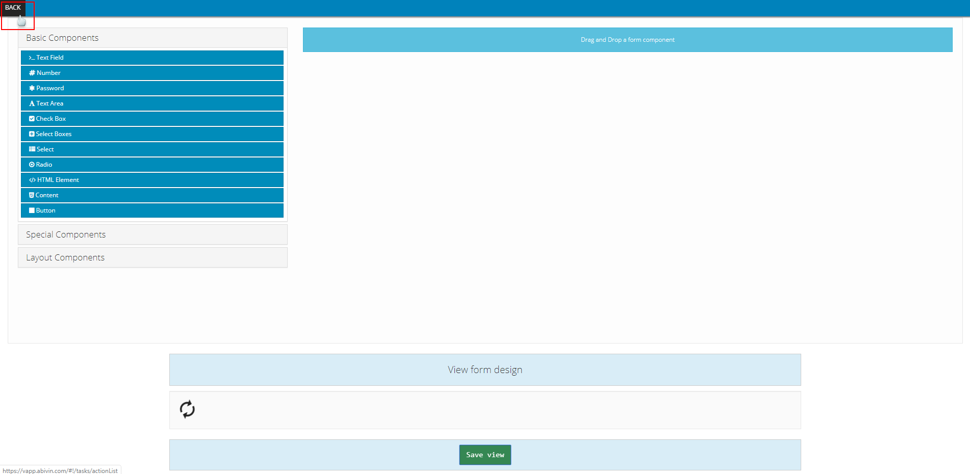
- Below are the chronological steps to build the forms for each Action Code
1. LOADING_AT_DEPOT Action Code
- For this Action Code, you will need to build the following forms (Click on the text to directly navigate to the content):
- 1 - The Order information table, which shows the information of the Orders that the Drivers need to load onto their Vehicles at the Depot at the start of their assigned Delivery Shift
- 2 - The Check-in panel, which allows the Drivers to check-in at the start of their Delivery Shifts
- 3 - The confirmation panel, through which the Drivers will confirm several statuses before actually leaving the Depot such as: Have finished loading Products; Have left the warehouse etc.
- Here is how the final Action Code will look like after you have completed building its forms:
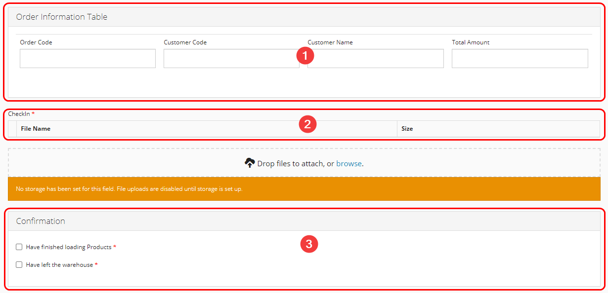
Illustration (English)
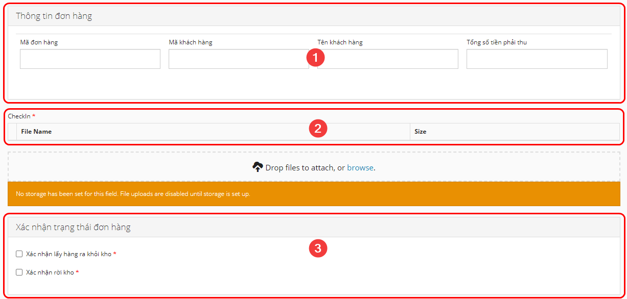
Illustration (Vietnamese)
1.1. Order Information Table
1.1.1. Order Information Panel
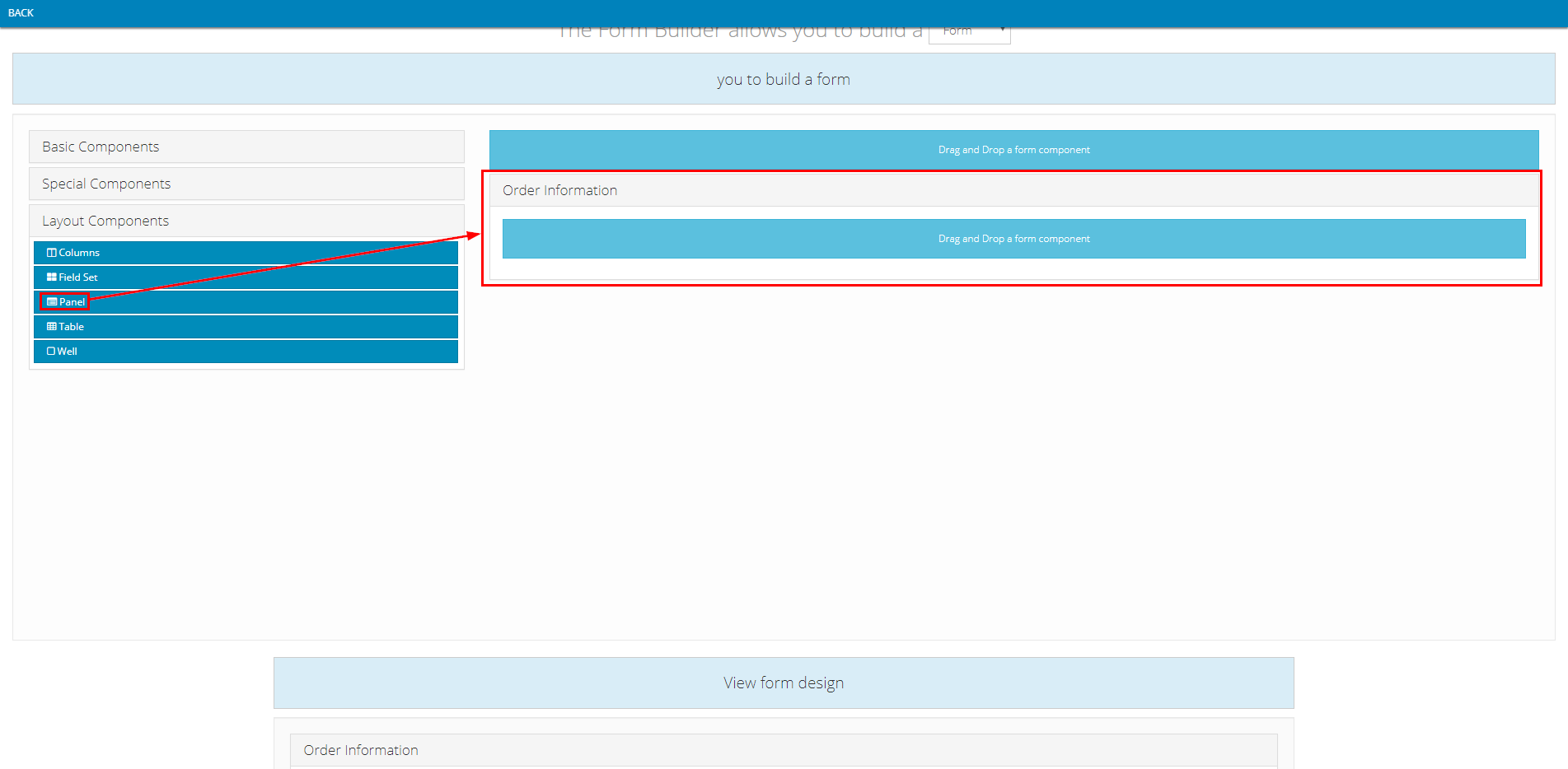
- Component used: Layout Components > Panel
- Position: On top
- Component content:
- On the component setup form of this component, you need to input information into two tabs, Display and API
- Note: The value input into the Title field in the Display tab can be changed freely. It doesn't necessarily need to be Order Information

Illustration (English)

Illustration (Vietnamese)
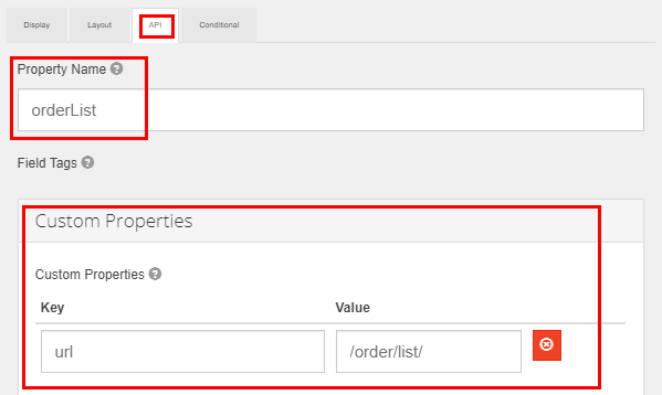
- In the API tab, you will need to input exactly as shown in the table below (Notice the lowercase and uppercase letters)
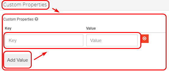
- Note: For the Custom Properties field, you will first need to click on its text to expand it. Next, you need to click the Add Value button to add a Key-Value row
- To ensure there is no mistake, you can simply copy the values in the table below and paste into the component setup form of yours
Information Field | Value To Input |
|---|---|
"Property Name" | orderList |
"Custom Properties" | For the "Key" field, input the following value: url |
- Here is how this tab looks after you have input the needed information
1.1.2. Order Information Table
- Component used: Layout Components > Table
- Position: Inside the Order Information panel
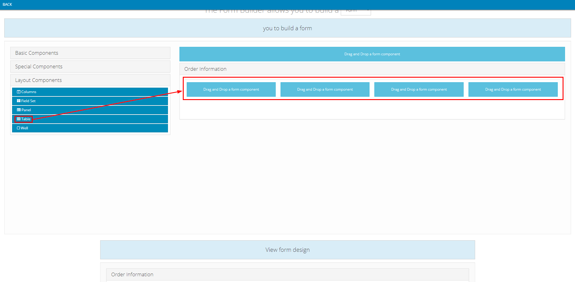
- Component content:
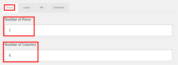
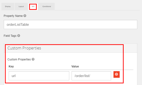
- On the component setup form of this component, you need to input information into two tabs, Display and API
Information Field | Value To Input |
|---|---|
"Display" tab "Number of Rows" | 1 |
"Display" tab | 4 |
"API" tab | For the "Key" field, input the following value: url |
1.1.3. Order Code Column
- Component used: Basic Components > Text Field
- Position: Inside the Order Information Table
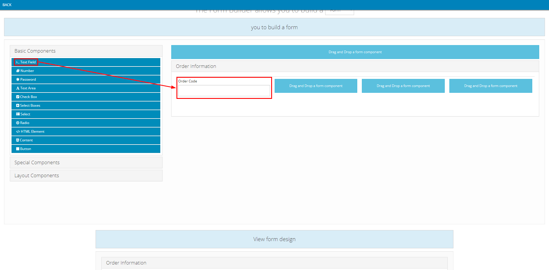
- Component content:
- On the component setup form of this component, you need to input information into two tabs, Display and API
- Note: The value input into the Title field in the Display tab can be changed freely. It doesn't necessarily need to be Order Code

- For the API tab, you need to input the exact value as shown in the table below
Information Field | Value To Input |
|---|---|
"Property Name" | orderCode |

1.1.4. Customer Code Column
- Component used: Basic Components > Text Field
- Position: Inside the Order Information Table, to the right of the Order Code Column
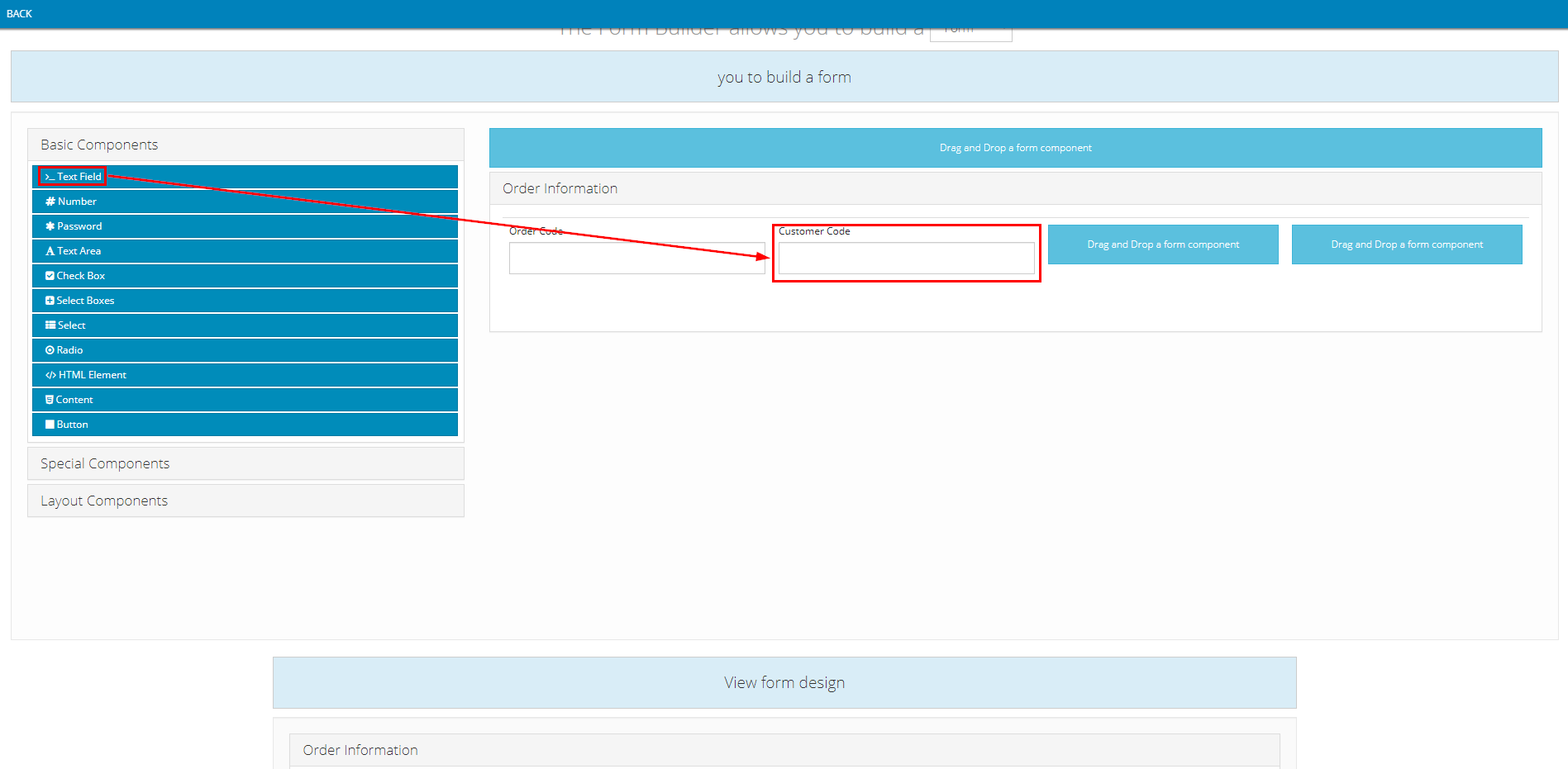
- Component content:
- On the component setup form of this component, you need to input information into two tabs, Display and API
- Note: The value input into the Label field in the Display tab can be changed freely

- For the API tab, you need to input the exact value as shown in the table below
Information Field | Value To Input |
|---|---|
"Property Name" | customerInfo.customerCode |

1.1.5. Customer Name Column
- Component used: Basic Components > Text Field
- Position: Inside the Order Information Table, to the right of the Customer Code Column
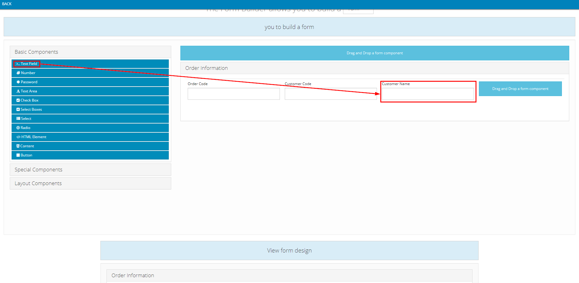
- Component content:
- On the component setup form of this component, you need to input information into two tabs, Display and API
- Note: The value input into the Label field in the Display tab can be changed freely

- For the API tab, you need to input the exact value as shown in the table below
Information Field | Value To Input |
|---|---|
"Property Name" | customerInfo.fullName |

1.1.6. Total Amount Column
- Component used: Basic Components > Text Field
- Position: Inside the Order Information Table, to the right of the Customer Name Column
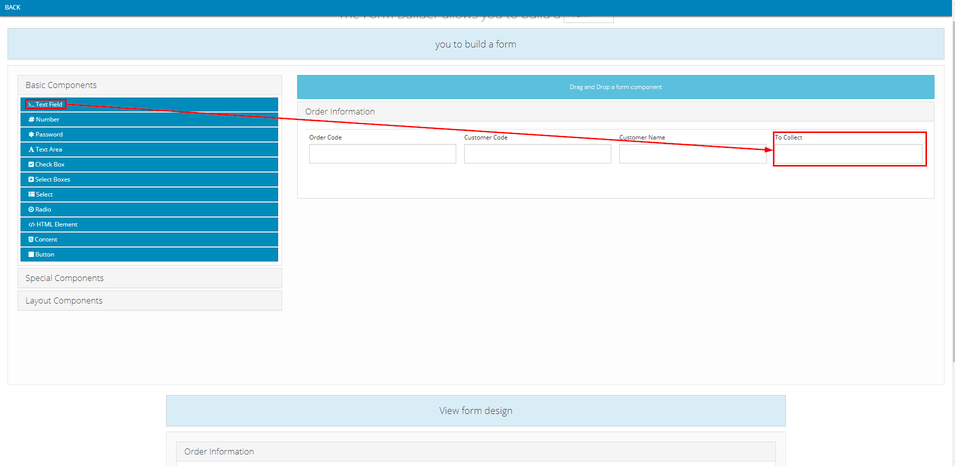
- Component content:
- On the component setup form of this component, you need to input information into two tabs, Display and API
- Note: The value input into the Label field can be changed freely

- For the API tab, you need to input the exact value as shown in the table below
Information Field | Value To Input |
|---|---|
"Property Name" | totalPrice |

1.2. Check-In panel
- There are two options on how the driver can perform the Check-In action:
- Option 1. Check-in by submitting the coordinate information of the driver's current location
- Option 2. Check-in by taking a photo of the warehouse
1.2.1. Check-in By Submitting The Coordinate Information Of The Driver's Current Location
- Component used: Special Components > Address
- Position: Below the Order Information panel
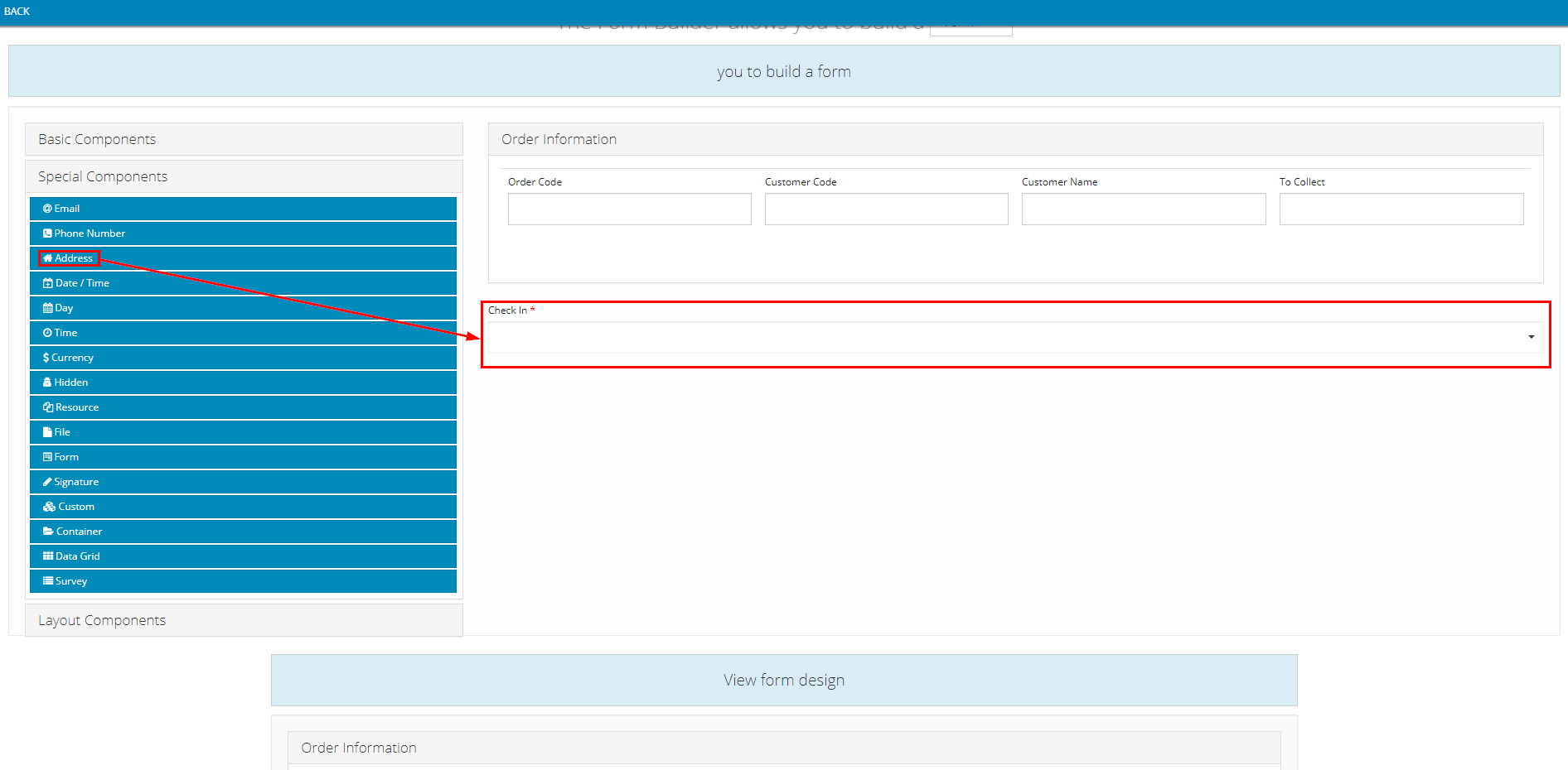
- Component content:
- Note: The value input into the Label field can be changed freely

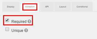
- In the Validation tab, if you tick the Required checkbox, the Drivers will not be able to submit the Loading at Depot task without performing the Check-in action. If you leave this checkbox unticked, the Drivers will be able to submit this task without having to perform the Check-in action
1.2.2. Check-in By Taking A Photo Of The Warehouse
- Component used: Special Components > File
- Position: Below the Order Information panel
- Component content:
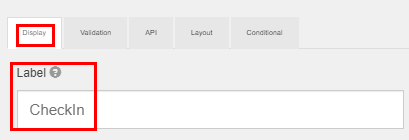
- Note: The value input into the Label field can be changed freely
- In the Validation tab, if you tick the Required checkbox, the Drivers will not be able to submit the Loading at Depot task without performing the Check-in action. If you leave this checkbox unticked, the Drivers will be able to submit this task without having to perform the Check-in action
- We strongly recommend you tick this checkbox because the moment that the Drivers perform this Check-in action will be recorded as the beginning timestamp of the Loading at Depot task and will reflect it on the Execution timeline of Route Plan (Map View) screen. If you don't tick this checkbox, the Drivers might bypass this action, thus the system will have no record of this task's beginning timestamp

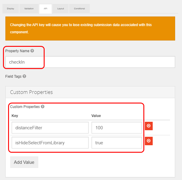
- For the API tab, you need to input the exact value as shown in the table below
Information Field | Value To Input |
|---|---|
"Property Name" | (Required. Do not leave this field blank) checkIn |
"Custom Properties" | (Required) Key-Value 1: Specify if the Drivers can select a pre taken picture or will need to take a new picture |
1.3. Status Confirmation Section
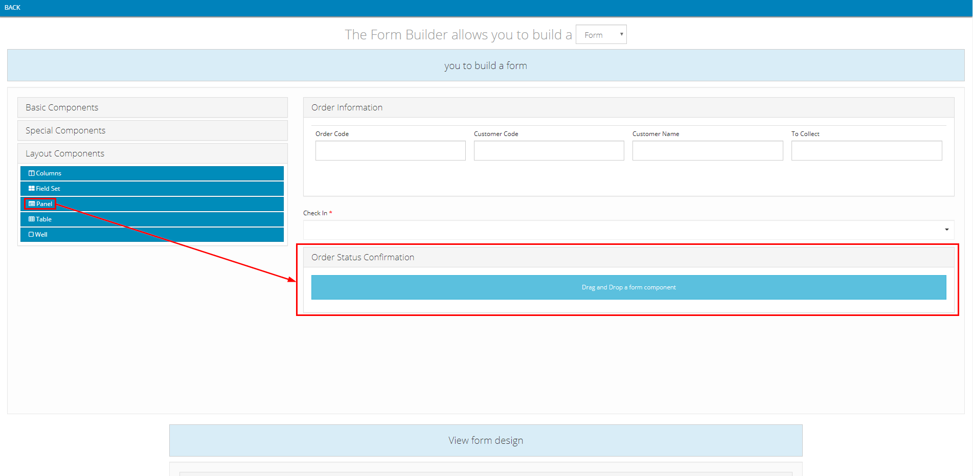
1.3.1. Status Confirmation Panel
- Component used: Layout Components > Panel
- Position: Below the Check-In panel
- Component content:
- Note: The value input into the Title field can be changed freely

- Next is the confirmation statuses. You can add as many confirmation statuses as you want. Below we will present a sample confirmation status
1.3.2. Confirm to have taken products out of the warehouse Checkbox
- Component used: Basic Components > Check Box
- Position: Inside the Status Confirmation Panel
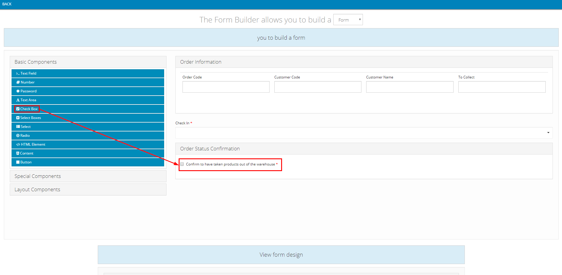
- Component content:
- Note: The value input into Label field can be changed freely

- In the Validation tab, if you tick the Required checkbox, the Drivers will not be able to submit the Loading at Depot task without confirming this status. If you leave this checkbox unticked, the Drivers will be able to submit this task without having to confirm this status

2. DELIVER_PRODUCT Action code
- For this Action Code, you will need to build the following forms:
- 1 - The Check-in panel, which allows the Drivers to check-in when they arrive at the Customers' receiving locations
- 2 - The delivery result section, which allows the Drivers to specify the delivery result
- (Optional) 3 - The Customer document photos section, which allows the Drivers to take pictures of important Customer documents such as invoices, deb book, etc.
- (Optional) 4 - The Customer signature section, which allows the Customers to sign directly on the mobile device of the Drivers
- Here is how the final Action Code will look like after you have completed building its forms:
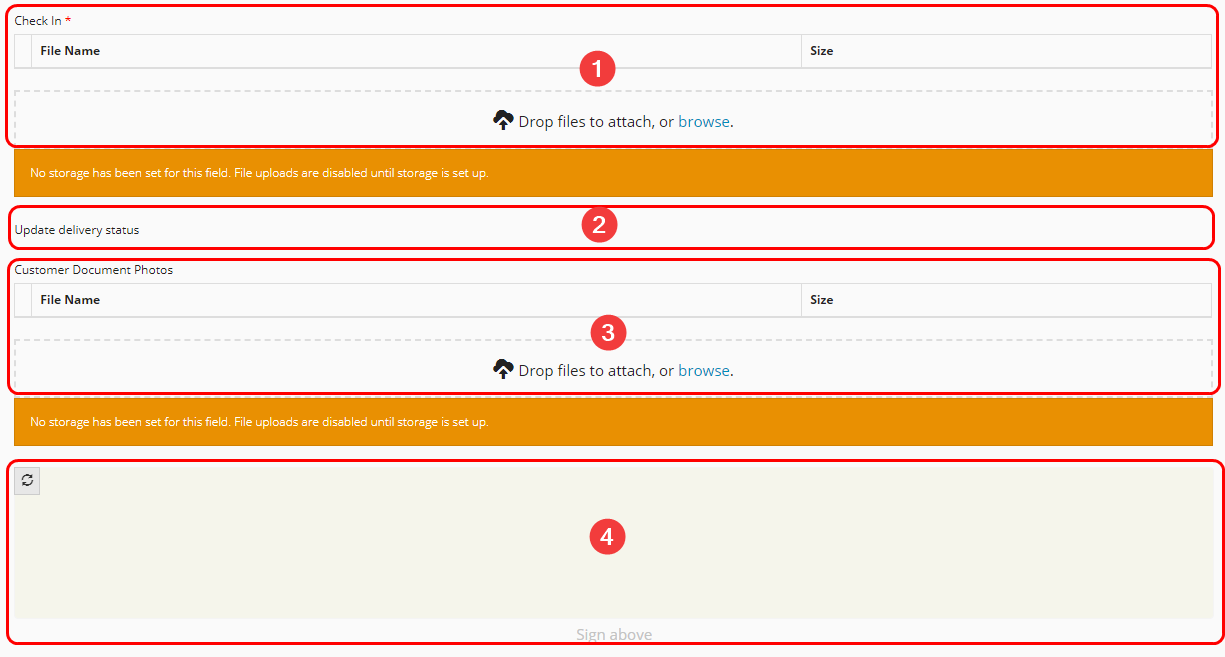
Illustration (English)
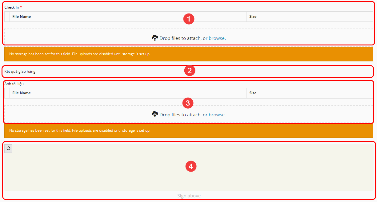
Illustration (Vietnamese)
2.1. Check-In panel
- The setup instruction is quite similar to the Check-in panel of the LOADING_AT_DEPOT Action Code
- If you also wish to set a maximum distance between the current standing locations of the Drivers and the Customers' actual receiving locations (Taken from the Customer coordinate information), then replace the distanceFilter key with the Geofencing key like so
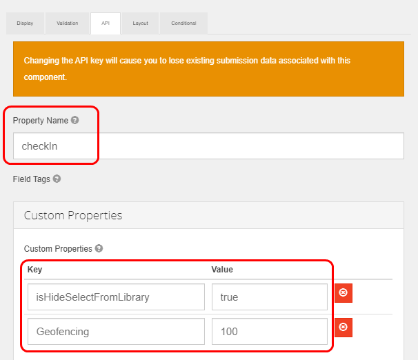
2.2. Delivery Result Section
- Component used: Special Components > Container
- Position: Below the Check-in panel
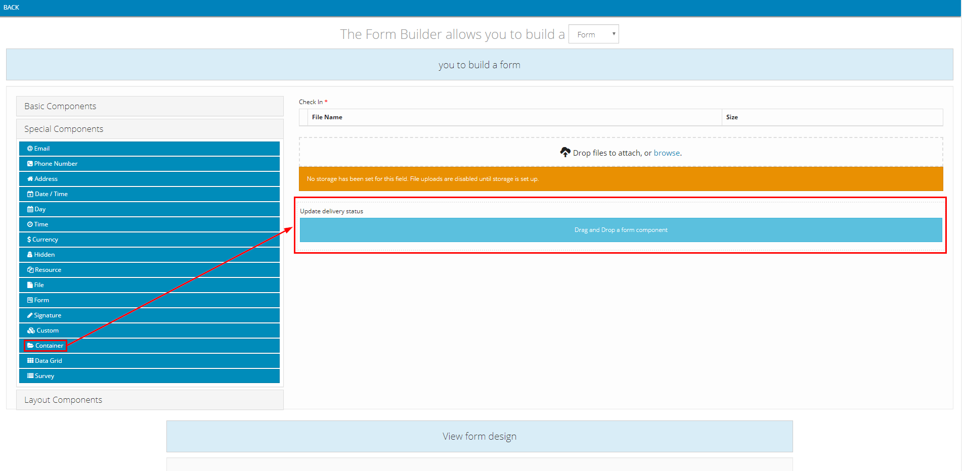
- Component content:
- Note: The value input into the Label field can be changed freely

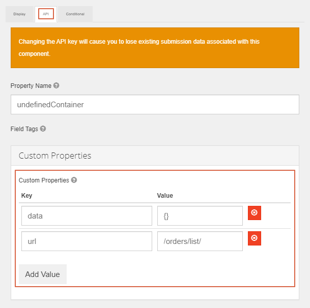
- For the API tab, you need to input the exact value as shown in the table below
Information Field | Value To Input |
|---|---|
"Custom Propertise" | (Required) Key-Value 1: |
2.3. Customer Document Photos Section
- Component used: Special Components > File
- Position: Below the Delivery Result section
- Component content:
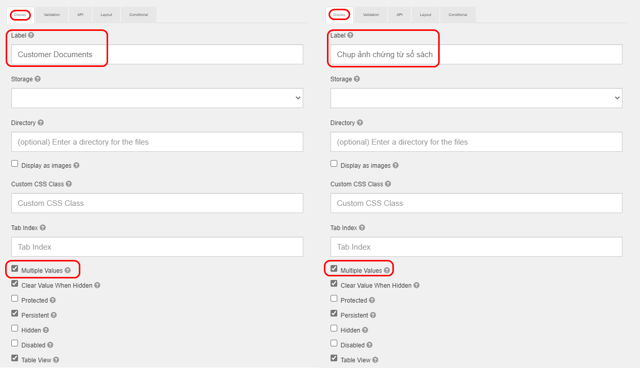
- Note: The value input into the Label field in the Display tab can be changed freely
- Do not forget to tick the Multiple Values checkbox. If this checkbox is not ticked, you will not be able to take multiple photos
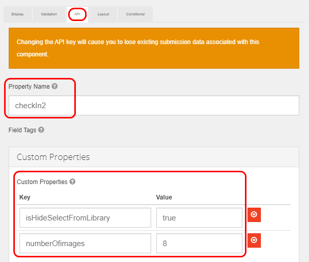
- In the API tab, input the exact values as shown in the table below
Information Field | Value To Input |
|---|---|
"Property Name" | (Required) checkIn2 |
"Custom Properties" | (Required) Key-Value 1: |
2.4. Customer Signature Section
- Component used: Special Components > Signature
- Position: Below the Customer Document Photos section (If available) or the Delivery Result section
- Component content: You do not need to input anything
3. BACK_DEPOT Action code
3.1. Check In panel
- The setup instruction is similar to the Check-in panel of the LOADING_AT_DEPOT Action Code
4. END_DAY Action code
4.1. Check In panel
- The setup instruction is similar to the Check-in panel of the LOADING_AT_DEPOT Action Code
4.2. Update status at the end of day panel
- Component used: Layout Components > Panel
- Position: Below Check In panel component

4.3. Confirm to have handed all redundant products to the warehouse manager Check box
- Component used: Basic Components > Check Box
- Position: Inside Update status at the end of day panel component
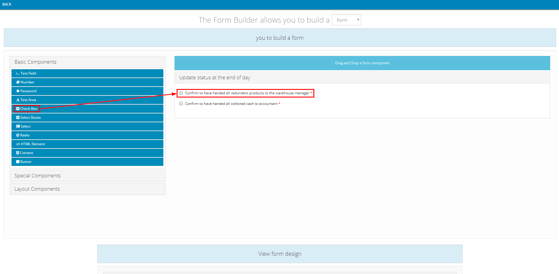
- Component content:
- Note: The value input into Label field can be changed freely


4.4. Confirm to have handed all collected cash to accountant Check box
- Component used: Basic Components > Check Box
- Position: Inside Update status at the end of day panel component, below Confirm to have handed all redundant products to the warehouse manager Check box component
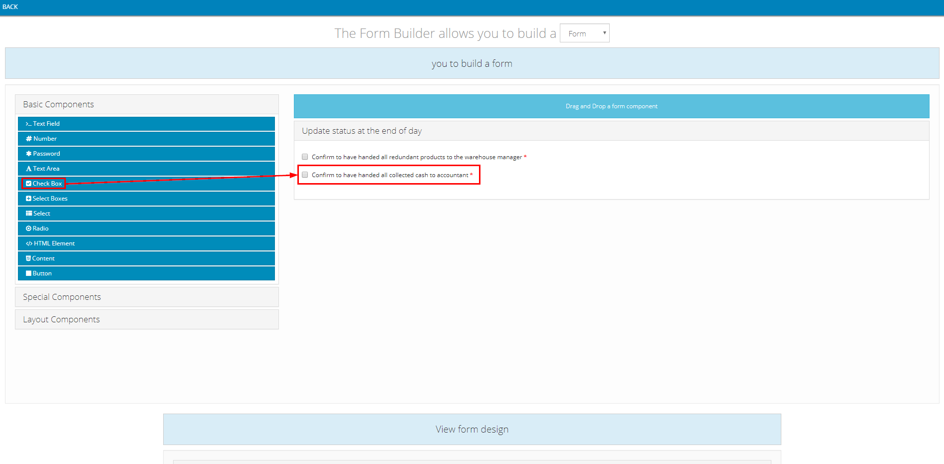
- Component content:
- Note: The value input into Label field can be changed freely


5. EXTRA_TASK Action code
5.1. Check In panel
- Set up similarly to the 1.7. Check In panel section above
5.2. Input Extra Task Type
- Component used: Basic Components > Radio
- Position: Below Check In panel component
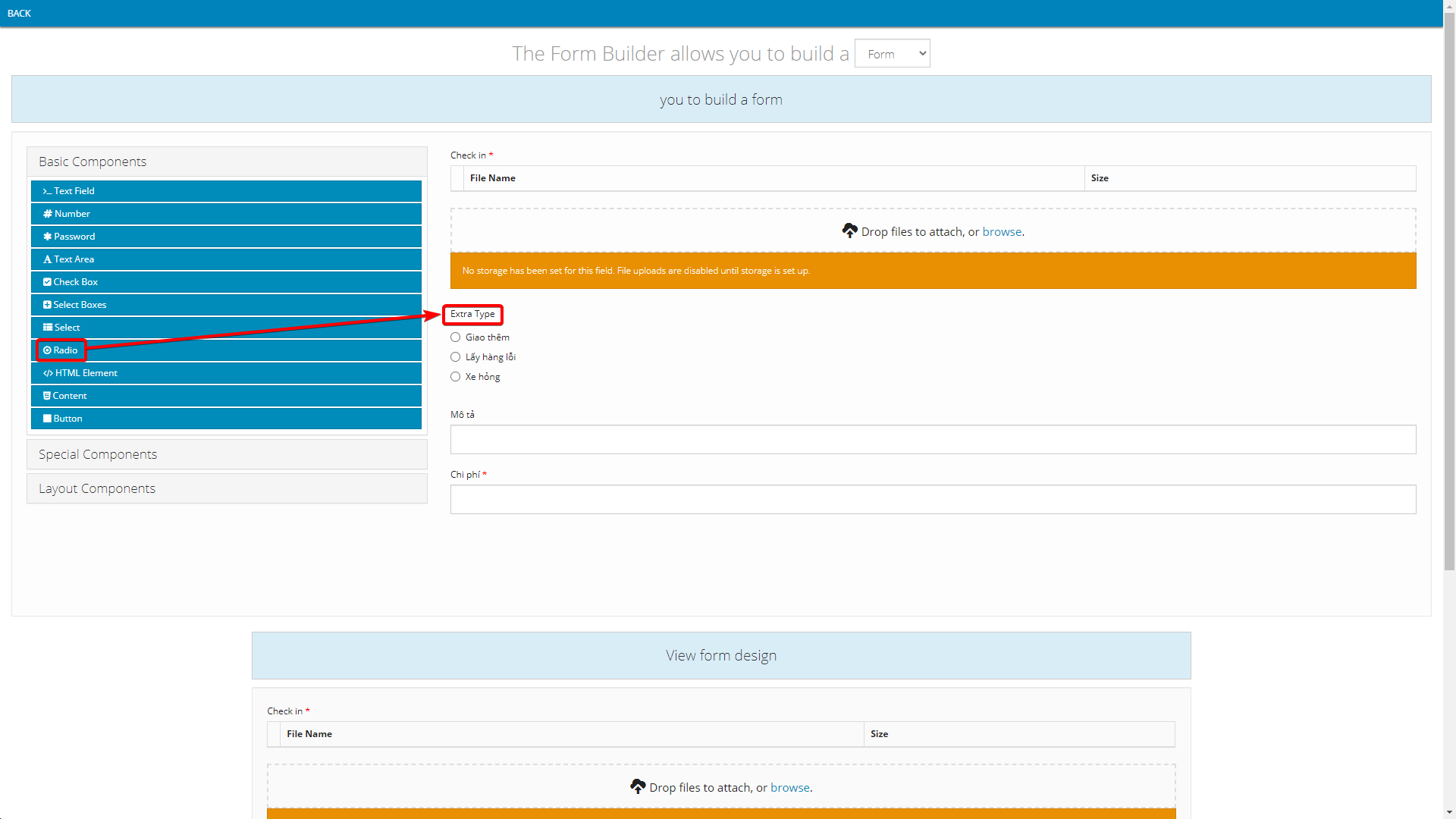
- Component content:
- Note: The value input into Label field can be changed freely
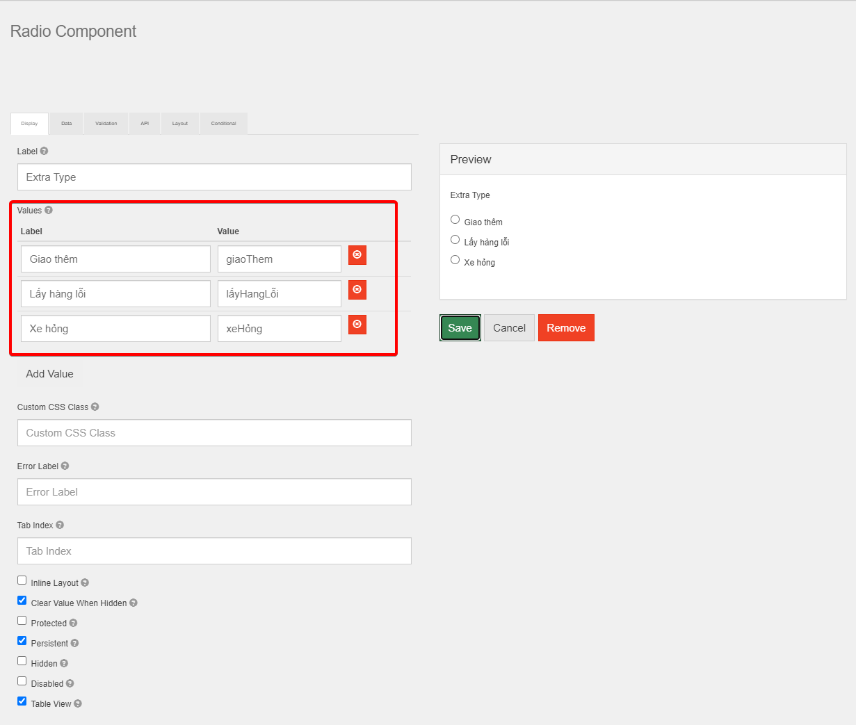
5.3. Input Description
- Component used: Basic Components > Text Field
- Position: Below Extra Task Type component
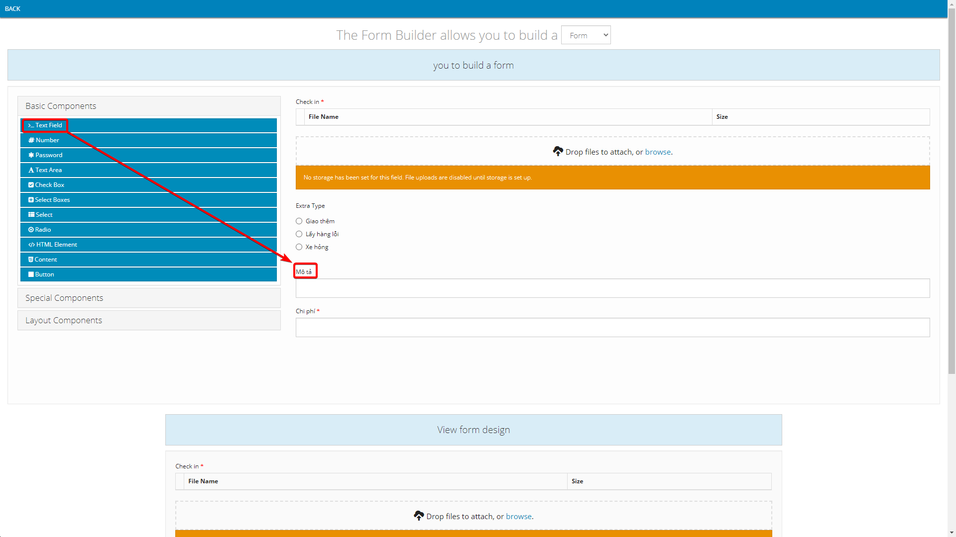
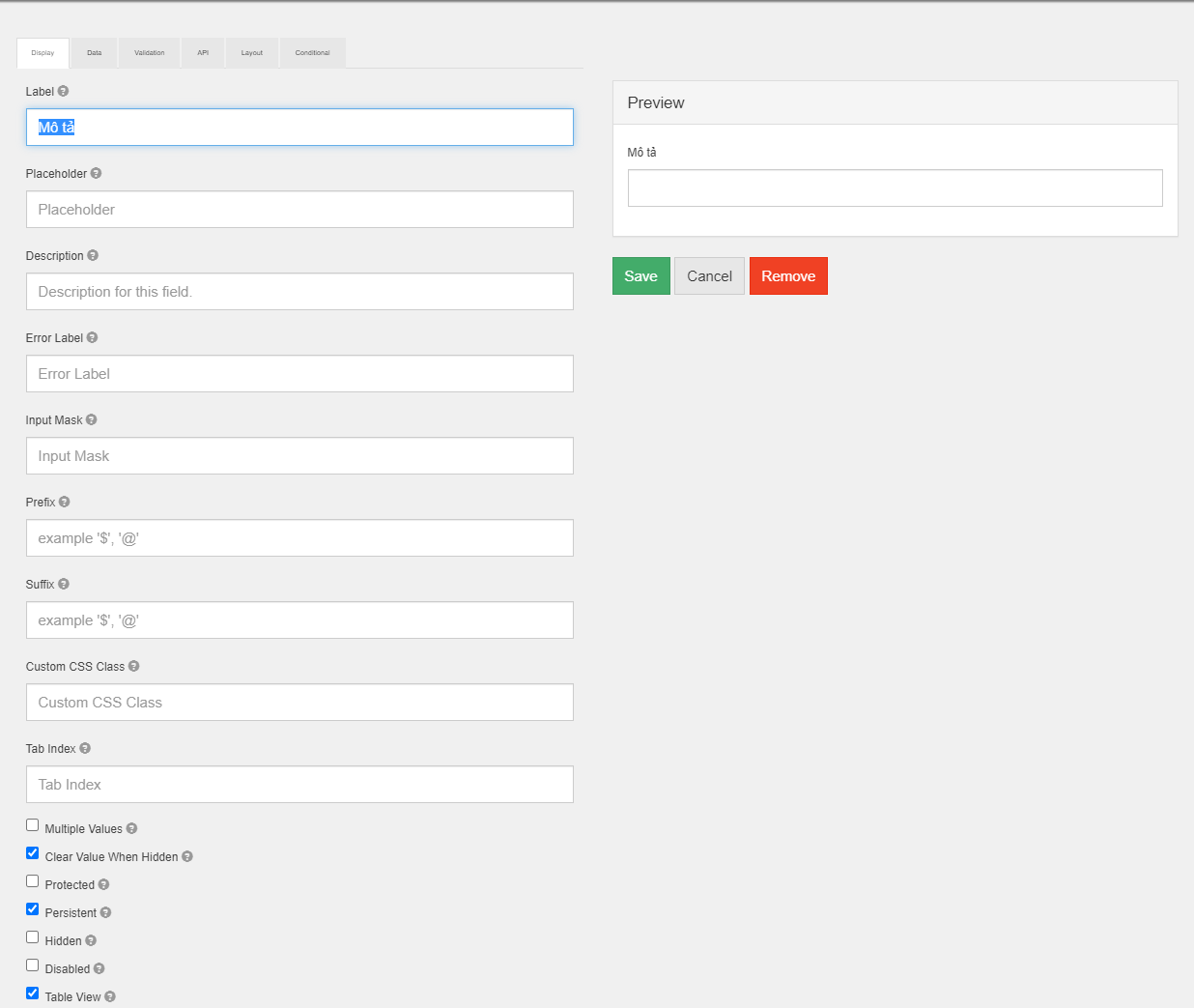
- Component content:
- Note: The value input into Label field can be changed freely
5.4. Input Price
- Component used: Basic Components > Number
- Position: Below Description component
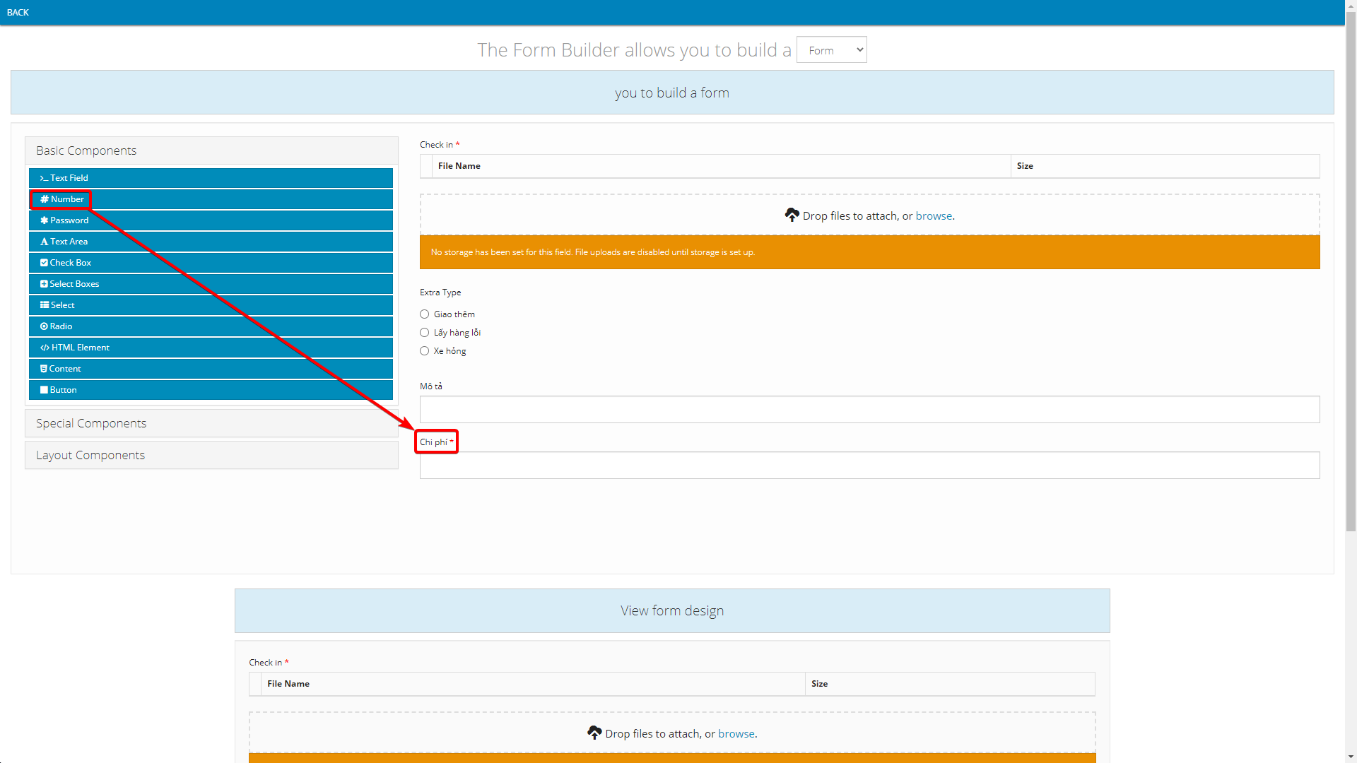
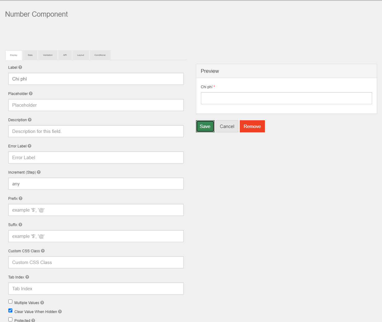
- Component content:
- Note: The value input into Label field can be changed freely
Updated about 1 month ago
