Dashboard
Select dashboard
- Navigate to Reports > Dashboard tab
- Click on Select Dashboard Type field, then choose the suitable dashboard from the drop down menu
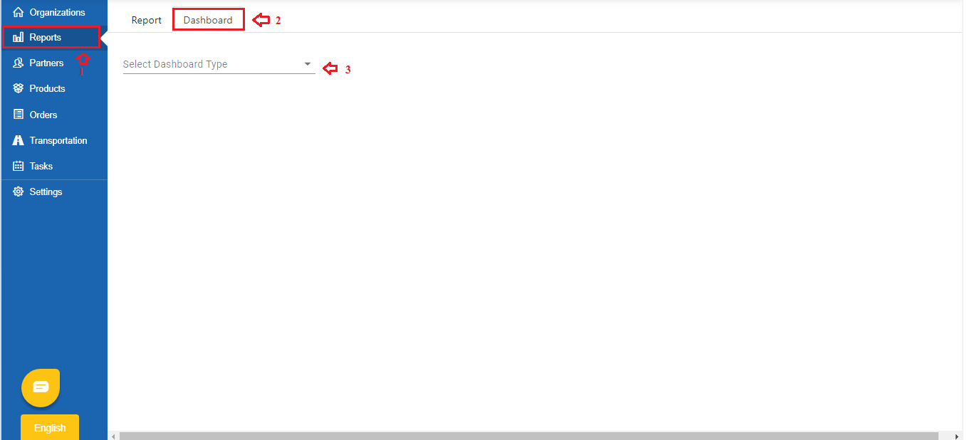
On-time Delivery
- This dashboard will help you view the quantity of orders by their status during a specific date range
- Click on the Date Range field, select the date range from the drop down menu
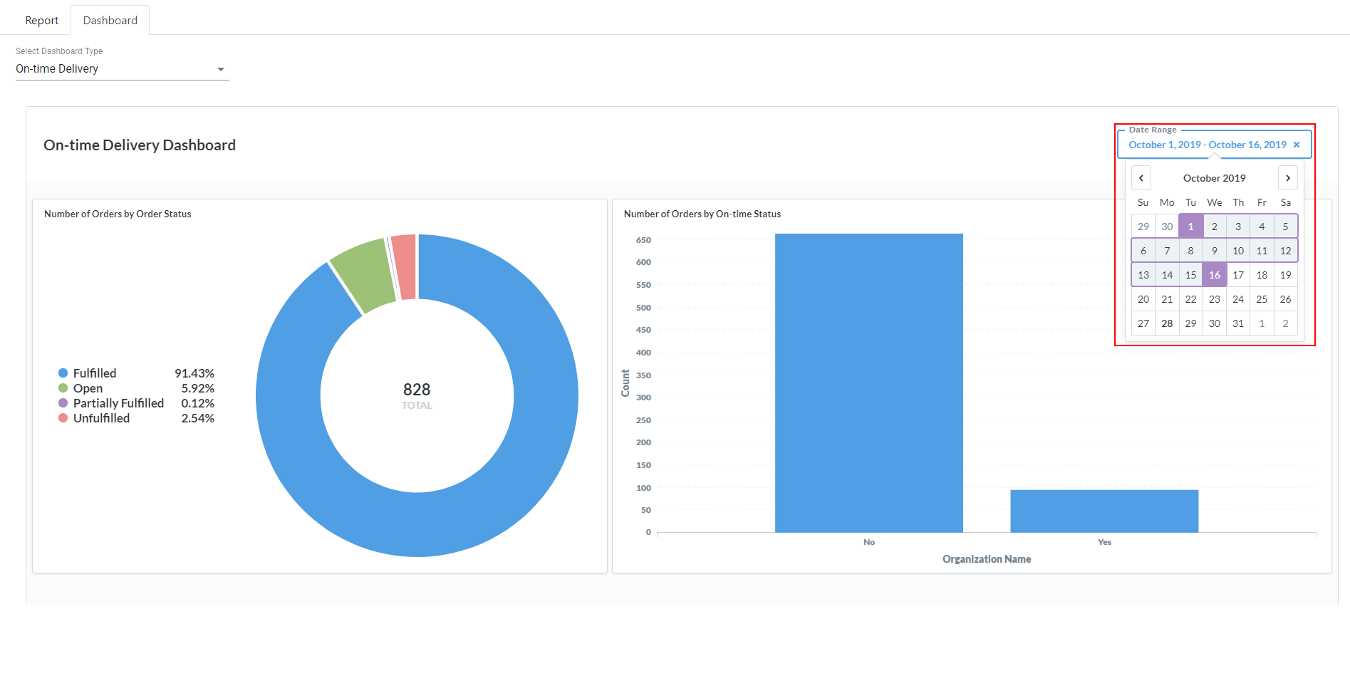
- The dashboard will automatically refresh to update data for the selected date range
- There will be two charts:
- Pie chart: Showing the Number of Orders by Order Status. There are four statuses, distinguished by its color
Order status color | Order status |
|---|---|
Blue color | Fulfilled |
Green color | Open |
Purple color | Partially Fulfilled |
Pink color | Unfulfilled |
- Bar chart: Showing the Number of Orders by On-time Status. The bar on the left (Titled Yes) displays the number of orders delivered on time, while the bar on the right (Titled No) displays the number of orders delivered not on time
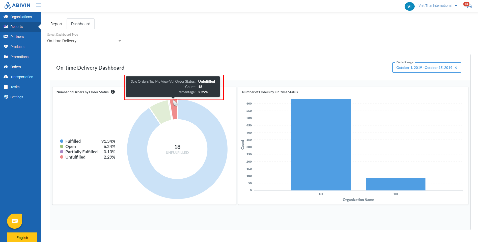
- As you hover on a specific status on the chart, there will be a tool tip displaying the detail. Also, the number inside the pie chart will change accordingly
Truck Utilization
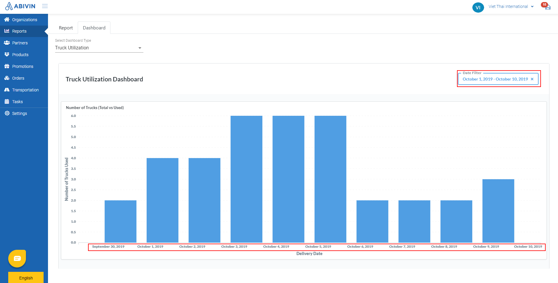
- This dashboard will help you view the quantity of truck used daily during a date range
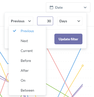
- Click on the Date Range field, select the date range from the drop down menu. There will be several ways to select the date range:
- Previous: Display the statistic for a date range before the current date. You may include the current date by clicking on Include today checkbox
- Next: Display the statistic for a date range after the current date. You may include the current date by clicking on Include today checkbox
- Current: Display the statistic for a specific date, week, month or year
- Before: Display the statistic before a specific date
- After: Display the statistic after a specific date
- On: Display the statistic on a specific date
- Between: Display the statistic of a date range between two specific dates
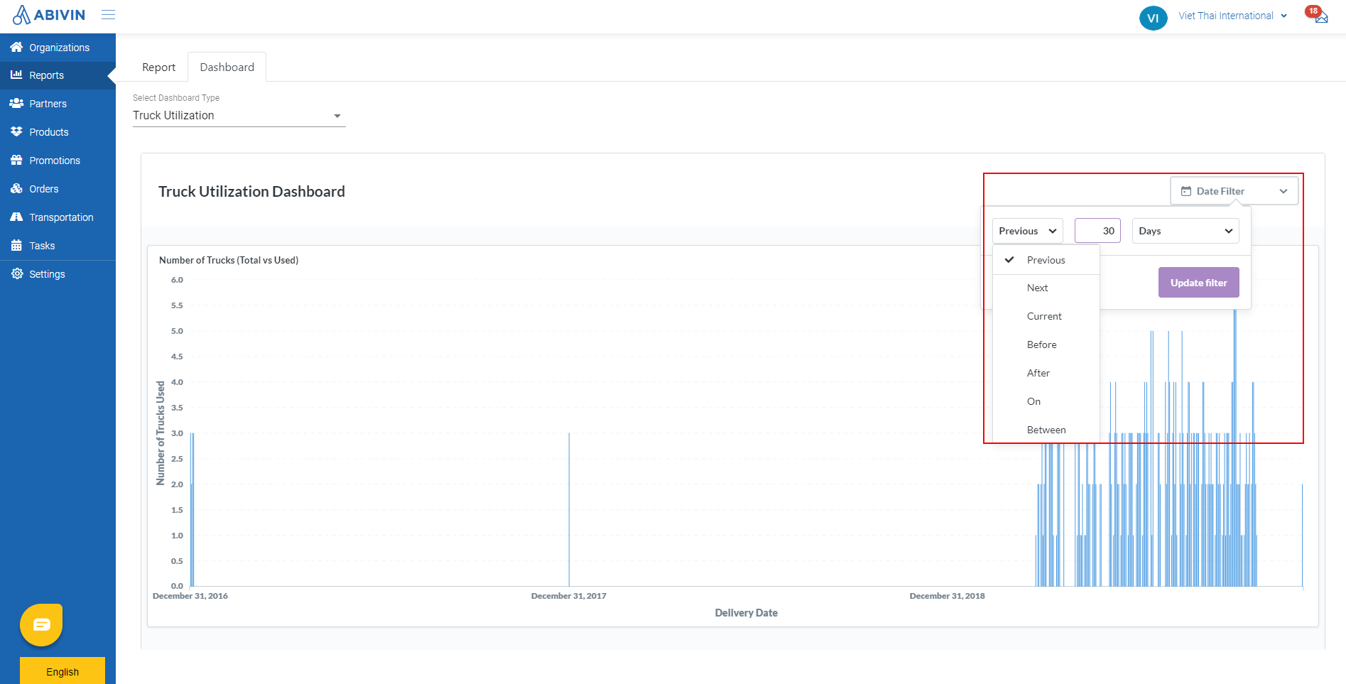
- After you have selected the appropriate date range, click on Update filter button. The system will automatically update data accordingly
Fuel Consumption
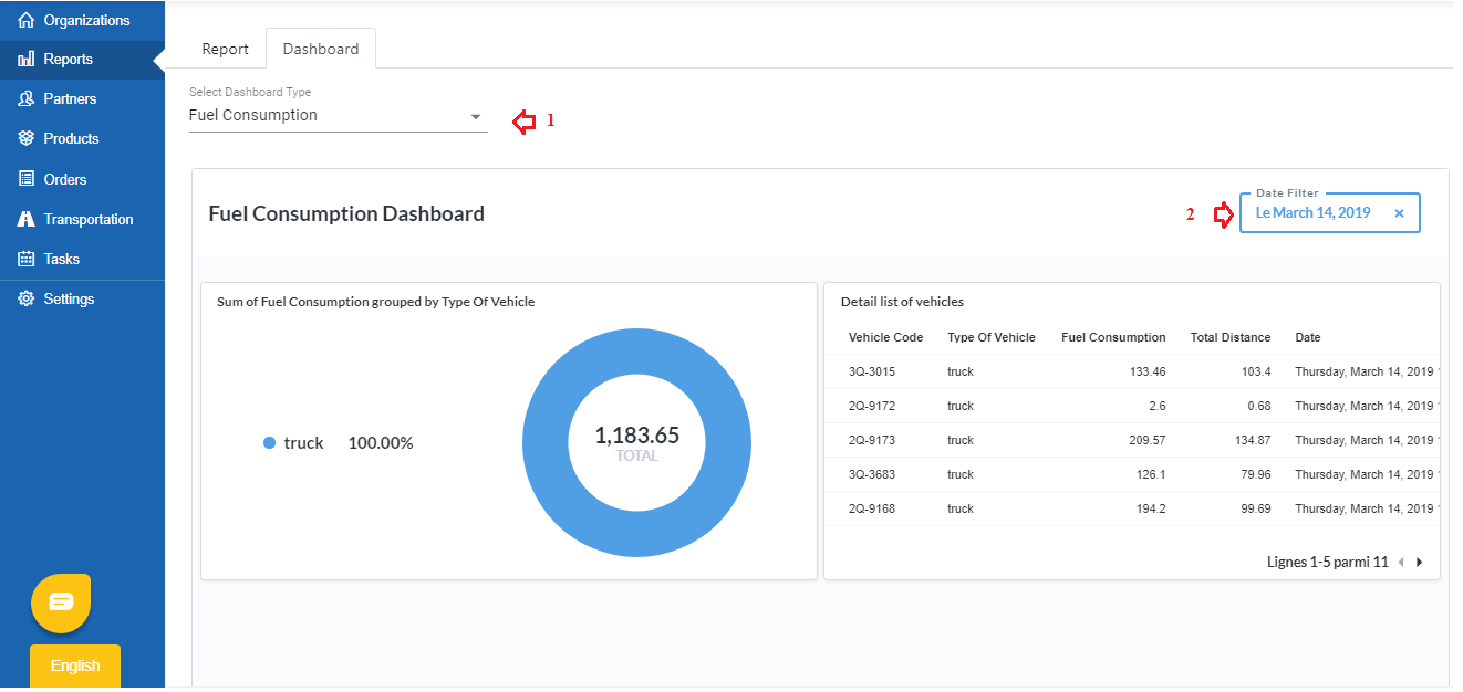
- This dashboard will help you view the total amount of fuel consumed and detail the fuel consumption of each vehicle within the a specific time frame
- Click on the Date Range field, select the date range from the drop down menu. There will be several ways to select the date range:
- Previous: Display the statistic for a date range before the current date. You may include the current date by clicking on Include today checkbox
- Next: Display the statistic for a date range after the current date. You may include the current date by clicking on Include today checkbox
- Current: Display the statistic for a specific date, week, month or year
- Before: Display the statistic before a specific date
- After: Display the statistic after a specific date
- On: Display the statistic on a specific date
- Between: Display the statistic of a date range between two specific dates
Key Performance Indicators (KPIs)
- This dashboard will help you view the Key Performance Indicators (KPIs) of the vehicles and drivers. It is actually the visualization of ST02 Report - KPI scoreboard
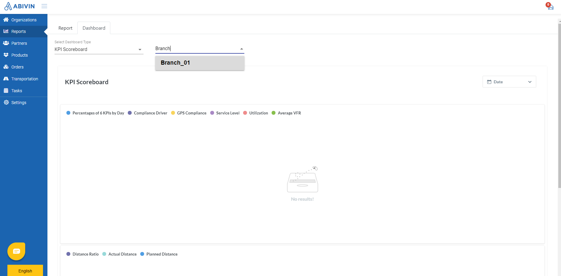
- This dashboard consists of two charts: Percentages of 6 KPIs by Day and Sum of Planned & Actual Distance by Day
- First, you need to choose the Branch by clicking on the Select Branch field, input the Organization Name of the Branch into the search bar, then select from the drop down menu
- Click on the Date Range field, select the date range from the drop down menu. There will be several ways to select the date range:
- Previous: Display the statistic for a date range before the current date. You may include the current date by clicking on Include today checkbox
- Next: Display the statistic for a date range after the current date. You may include the current date by clicking on Include today checkbox
- Current: Display the statistic for a specific date, week, month or year
- Before: Display the statistic before a specific date
- After: Display the statistic after a specific date
- On: Display the statistic on a specific date
- Between: Display the statistic of a date range between two specific dates
- The dashboard will automatically update the data and shows on the two charts: Percentages of 6 KPIs by Day and Sum of Planned & Actual Distance by Day

Percentages of 6 KPIs by Day
- Below is the list of information fields of the two charts:
- Percentages of 6 KPIs by Day chart
Information field | Description |
|---|---|
Adoption | The ratio of the number of drivers who have used Abivin App over the total number of drivers |
Compliance Driver | The ratio of Executed Tasks over Planned tasks of all drivers |
GPS Compliance | The ratio of the number of correct Check-in (in range of 200 m) over the total Number of Check-in of all drivers |
Service Level | The ratio of the number of delivered orders over the number of planned orders |
Utilization | The ratio of the number of trucks used over the total number of trucks |
Average VFR | The average vehicle fill rate (by volume) of all trips |
Average WFR | The average vehicle fill rate (by weight) of all trips |
- Sum of Planned & Actual Distance by Day chart

Information field | Description |
|---|---|
Actual Distance | The total actual distance traveled by all vehicles, in kilometers |
Planned Distance | The total planned distance of all vehicles, in kilometers |
Distance Ratio | The ratio of Actual Distance over Planned Distance of all vehicles |
Updated about 1 month ago
